The Lattice Plotting System in R

Roger D. Peng, Associate Professor of Biostatistics
Johns Hopkins Bloomberg School of Public Health

The Lattice Plotting System

The lattice plotting system is implemented using the following packages:

  • lattice: contains code for producing Trellis graphics, which are independent of the “base” graphics system; includes functions like xyplot, bwplot, levelplot

  • grid: implements a different graphing system independent of the “base” system; the lattice package builds on top of grid

    • We seldom call functions from the grid package directly
  • The lattice plotting system does not have a "two-phase" aspect with separate plotting and annotation like in base plotting

  • All plotting/annotation is done at once with a single function call
Lattice Functions

  • xyplot: this is the main function for creating scatterplots
  • bwplot: box-and-whiskers plots (“boxplots”)
  • histogram: histograms
  • stripplot: like a boxplot but with actual points
  • dotplot: plot dots on "violin strings"
  • splom: scatterplot matrix; like pairs in base plotting system
  • levelplot, contourplot: for plotting "image" data

Lattice Functions

Lattice functions generally take a formula for their first argument, usually of the form

xyplot(y ~ x | f * g, data)
  • We use the formula notation here, hence the ~.

  • On the left of the ~ is the y-axis variable, on the right is the x-axis variable

  • f and g are conditioning variables — they are optional

    • the * indicates an interaction between two variables
  • The second argument is the data frame or list from which the variables in the formula should be looked up

    • If no data frame or list is passed, then the parent frame is used.
  • If no other arguments are passed, there are defaults that can be used.

Simple Lattice Plot

library(lattice)
library(datasets)
## Simple scatterplot
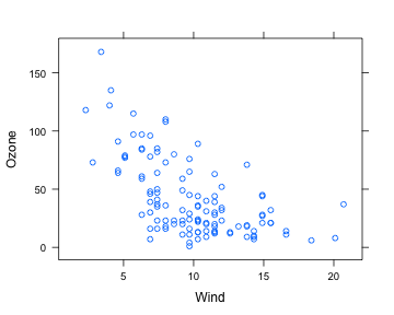
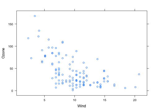
xyplot(Ozone ~ Wind, data = airquality)

plot of chunk unnamed-chunk-1

Simple Lattice Plot

library(datasets)
library(lattice)
## Convert 'Month' to a factor variable
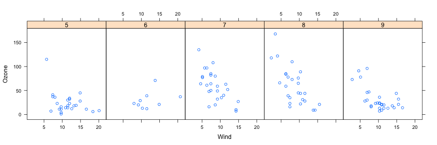
airquality <- transform(airquality, Month = factor(Month))
xyplot(Ozone ~ Wind | Month, data = airquality, layout = c(5, 1))

plot of chunk unnamed-chunk-2

Lattice Behavior

Lattice functions behave differently from base graphics functions in one critical way.

  • Base graphics functions plot data directly to the graphics device (screen, PDF file, etc.)

  • Lattice graphics functions return an object of class trellis

  • The print methods for lattice functions actually do the work of plotting the data on the graphics device.

  • Lattice functions return "plot objects" that can, in principle, be stored (but it’s usually better to just save the code + data).

  • On the command line, trellis objects are auto-printed so that it appears the function is plotting the data

Lattice Behavior

p <- xyplot(Ozone ~ Wind, data = airquality)  ## Nothing happens!
print(p)  ## Plot appears

plot of chunk unnamed-chunk-3

xyplot(Ozone ~ Wind, data = airquality)  ## Auto-printing

Lattice Panel Functions

  • Lattice functions have a panel function which controls what happens inside each panel of the plot.

  • The lattice package comes with default panel functions, but you can supply your own if you want to customize what happens in each panel

  • Panel functions receive the x/y coordinates of the data points in their panel (along with any optional arguments)

Lattice Panel Functions

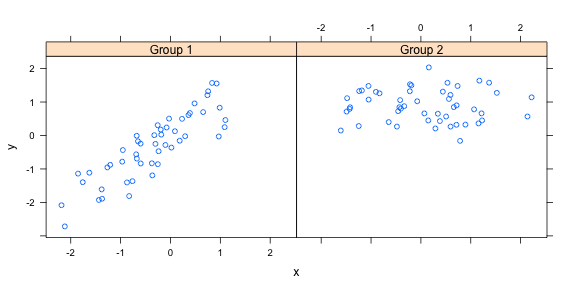
set.seed(10)
x <- rnorm(100)
f <- rep(0:1, each = 50)
y <- x + f - f * x + rnorm(100, sd = 0.5)
f <- factor(f, labels = c("Group 1", "Group 2"))
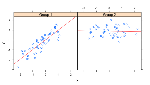
xyplot(y ~ x | f, layout = c(2, 1))  ## Plot with 2 panels

plot of chunk unnamed-chunk-5

Lattice Panel Functions

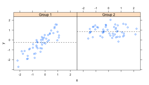
## Custom panel function
xyplot(y ~ x | f, panel = function(x, y, ...) {
    panel.xyplot(x, y, ...)  ## First call the default panel function for 'xyplot'
    panel.abline(h = median(y), lty = 2)  ## Add a horizontal line at the median
})

plot of chunk unnamed-chunk-6

Lattice Panel Functions: Regression line

## Custom panel function
xyplot(y ~ x | f, panel = function(x, y, ...) {
    panel.xyplot(x, y, ...)  ## First call default panel function
    panel.lmline(x, y, col = 2)  ## Overlay a simple linear regression line
})

plot of chunk unnamed-chunk-7

Many Panel Lattice Plot: Example from MAACS

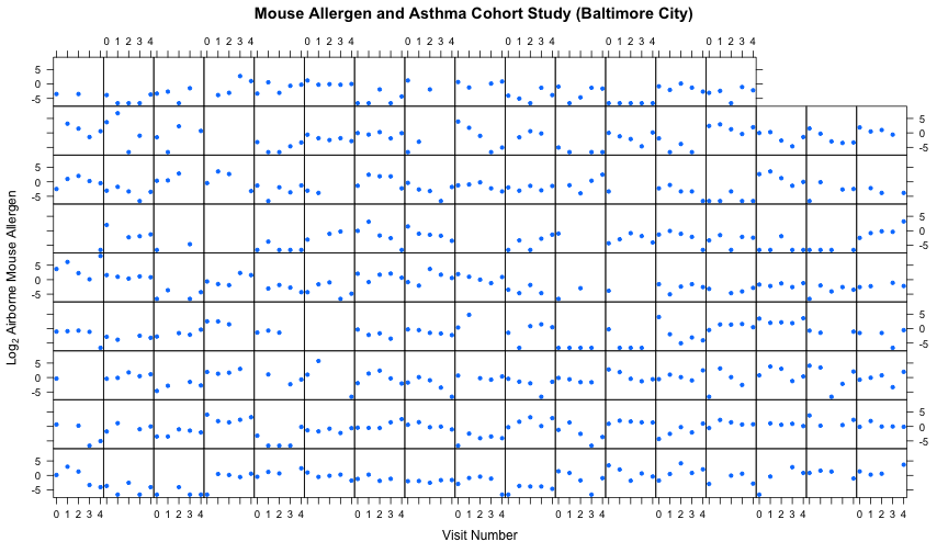
  • Study: Mouse Allergen and Asthma Cohort Study (MAACS)

  • Study subjects: Children with asthma living in Baltimore City, many allergic to mouse allergen

  • Design: Observational study, baseline home visit + every 3 months for a year.

  • Question: How does indoor airborne mouse allergen vary over time and across subjects?

Ahluwalia et al., Journal of Allergy and Clinical Immunology, 2013

Many Panel Lattice Plot

plot of chunk unnamed-chunk-8

Summary

  • Lattice plots are constructed with a single function call to a core lattice function (e.g. xyplot)

  • Aspects like margins and spacing are automatically handled and defaults are usually sufficient

  • The lattice system is ideal for creating conditioning plots where you examine the same kind of plot under many different conditions

  • Panel functions can be specified/customized to modify what is plotted in each of the plot panels